Race, Poverty, and Gender Ratios in Baltimore
For my the cluster analysis lab in GES 687, I decided I analyzed demographic data related to poverty, race, and the carceral state from the Baltimore Neighborhood Indicators Alliance’s 2016 Vital Signs dataset. This dataset consists of an ESRI Shapefile containing a map of Baltimore’s neighborhoods with a variety of demographic data provided for each neighborhood.
Selecting Statistics to Analyze
While a wide variety of statistics are available in the Vital Signs dataset, I decided to focus my analysis on three likely-to-be-related values: the percentage of each neighborhood’s residents that is African-American, the percentage that is female, and the percentage of households experiencing poverty.
Baltimore, like most American cities, has significant racial segregation correlated with poverty. Since the neighborhoods used for the Vital Signs data have quite variable sizes and populations, it seemed more reasonably to perform my analyses on the percentage of African-American residents than the total number of residents.
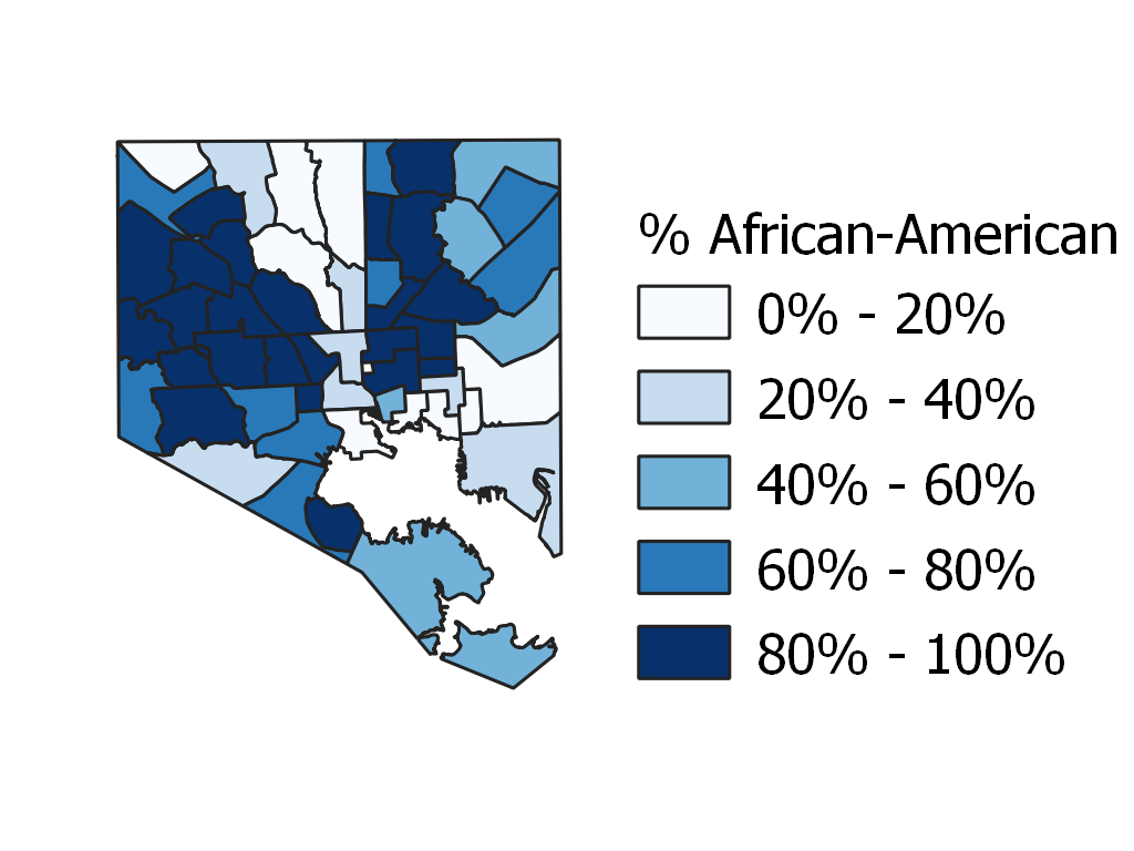 A map of the percentage of residents who are African-American in Baltimore neighborhoods. The city as a whole is roughly 60% African-American.
Baltimore’s African-American population is largely concentrated in a “butterfly” shape, with large areas with populations that are over 80% African-American west and northeasteast of downtown. The city’s white population, meanwhile, forms an “L” shape and is largely found in two corridors running north and east from downtown. The far southern part of the city is largely industrial and has quite low population densities.
Racial segregation in American cities is often related to economic segregation. There are several causes for this trend, including a variety of government policies that have consistently prevented people of color, and particularly African-Americans from having access to more desirable housing and from being able to achieve wealth and income levels comparable to white Americans.
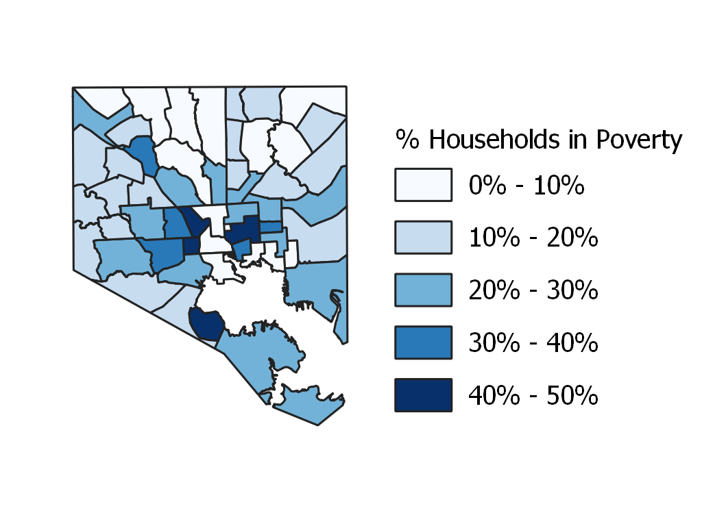 A map of the percentage of households that are experiencing poverty in Baltimore neighborhoods. City-wide, roughly 20% of households experience poverty.
Given the frequent correlation between race and poverty in American cities, I was not surprised to see that the percentage of households in poverty seemed to be higher in majority African-American areas of the city. It would have been interesting to compare median income statistics as well, but the Vital Signs dataset had limited metadata, making it difficult or impossible to extract this information from it.
An additional statistic that seemed worth analyzing is the gender breakdown of Baltimore residents. While the US population as a whole is roughly 49% female, the gender ratio of local areas is often quite different from this for a number of reasons, including high male populations in areas where a large fraction of the residents are located temporarily for extractive industry jobs (especially oil).
In urban areas, however, the most common source of gender disparities is the very high rate of incarceration of young men of color in many low-income neighborhoods. This sort of disparity is often both an indicator of areas with relatively high crime rates, and a product of the carceral state that can itself produce additional social problems in these neighborhoods.
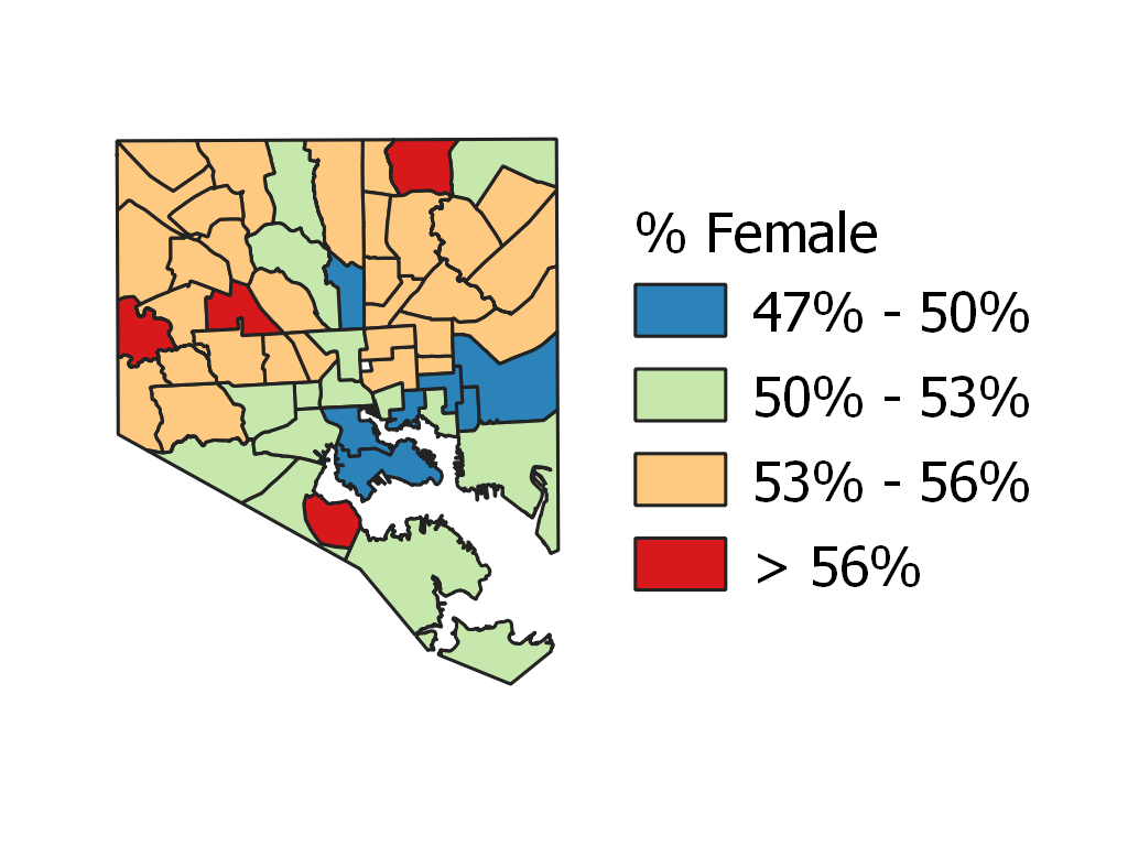 A map of the percentage of residents who are female in Baltimore neighborhoods. City-wide, roughly 53% of the population is female.
Although Baltimore as a whole is 53% female—still well above the national average—its individual neighborhoods vary from 47% to 59% female. Unsurprisingly, the highest percentages of female residents are generally found in poorer and more heavily African-American neigbhorhoods.
Neighborhood Connectivity in the Baltimore Vital Signs Data
While the data provided in the Vital Signs dataset is interesting, it is presented according to “neighborhood” areas that include large tracts of undeveloped park and cemetery land and other areas with essentially no residents.
Since an analysis of geographic autocorrelation depends on apparently-adjacent sectors actually meaningfully bordering each other, I chose to adjust the borders of the neighborhood areas so that they did not include large tracts of parkland, particularly Leakin Park, Gwynns Falls Park, Druid Hill Park, Loudon Park, Carroll Park, Clifton Park, and Herring Run Park.
Using these adjusted borders to create a “queen” connectivity weighing map, I was able to perform local Moran’s autocorrelation analyses without counting neighborhoods as bordering when their border was entirely in parkland.
Univariate Local Moran’s I Analysis
The first stage of my spatial autocorrelation analysis of Baltimore neighborhoods was to perform univariate local Moran’s I analyses for each of the three variables I chose to study. While each of the three variables apppears visually spatially autocorrelated, the Moran’s I analysis allows the determination of whether these correlations are statisitcally significant.
For each variable, I performed my analysis for p < 0.05 and 99,999 permuations, the maximum number possible using GeoDa.
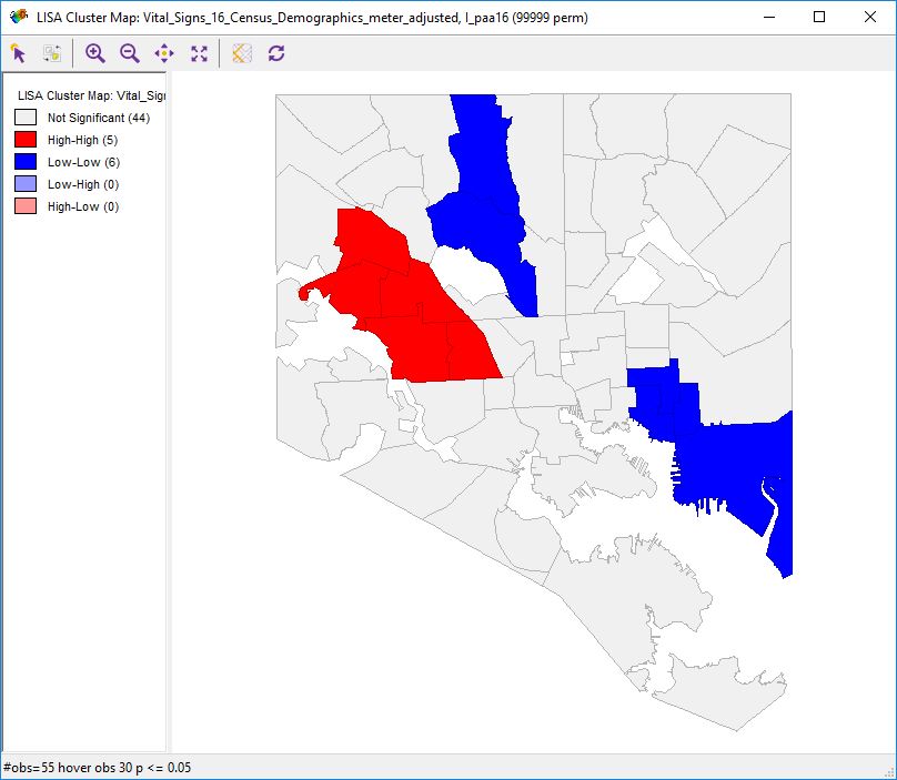 Univate local Moran’s I analysis of the percentage of African-American residents in Baltimore neighborhoods. Red indicates neighborhoods at the core of a cluster with a high percentage of African-American residents. Blue indicates neighborhoods at the core of clusters with a low percentage of African-American residents.
The local spatial autocorrelation analysis of the percentage of African-American residents in Baltimore neigbhorhoods largely confirms what appeared true from a visual analysis. Both sides of the “White L” are visible. However, only the left side of the “Black Butterfly” appears. I’m unclear on why the cluster of African-Americans northeast of downtown is absent, though it may be due to the relatively low number of neigbhorhoods involved and the fact that they are not well-connected.
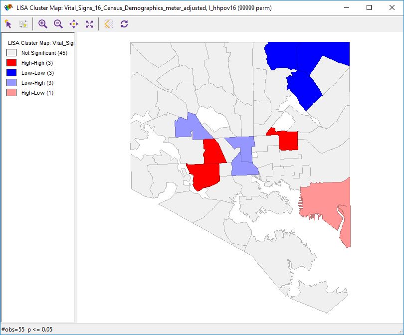 Univate local Moran’s I analysis of the percentage of households experiencing poverty in Baltimore neighborhoods. Dark red indicates neighborhoods at the core of clusters with a high percentage households experiencing poverty. Dark blue indicates neighborhoods at the core of clusters with a low percentage households experiencing poverty. Light blue indicates neighborhoods with a significantly lower percentage of residents experiencing poverty than their neighbors and light red indicates neighborhoods with a significantly higher percentage of residents experiencing poverty than their neighbors.
The results of the local spatial autocorrelation analysis of the percentage of households in poverty in Baltimore neighborhoods is somewhat more surprising. It shows two clusters of high-poverty areas to the east and west of downtown, but they are smaller than I expected, and only one low-poverty cluster, to the far northeast, appears. Meanwhile, downtown itself, and the area directly north of the western high-poverty cluster, appear as areas with relatively low poverty despite being surrounded by high-poverty areas. The far southeast of the city, on the other hand, shows up as an area with relatively high poverty despite being near low-poverty areas.
What seems particularly notable about this data is that in a number of places, it seems not to match the general pattern seen in the racial data, something that needs to be examined further via bivariate analysis.
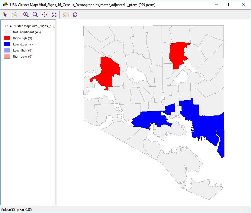 Univate local Moran’s I analysis of the percentage of female residents in Baltimore neighborhoods. Red indicates neighborhoods at the core of clusters with a high percentage of female residents. Blue indicates neighborhoods at the core of clusters with a low percentage of female residents.
The local spatial autocorrelation analysis of the gender ratios of Baltimore neighborhoods was a bit closer to what was expected. It did show clusters of high-percentage-female neigbhorhoods in both areas with particularly high numbers of African-American residents. It also showed that the lower half of the “white L,” but not the upper half of it, has a very large cluster of neighborhoods with low npercentages of female residents.
Bivariate Local Moran’s I Analysis
To determine whether the clusters found with the univariate local Moran’s I analyses of the three variables were related, I decided to perform bivariate analyses of each of the three possible pairs of the two variables. The purpose of this analysis was to determine to what degree the three variables were spatially correlated with each other.
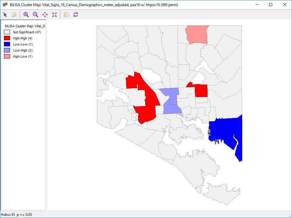 Bivariate local Moran’s I analysis of the percentage of African-American residents versus the percentage of households experiencing poverty in Baltimore neighborhoods. Dark red indicates clusters with high concentrations of both African-American residents and households experiencing poverty. Dark blue indicates clusters with low concentrations of both African-American residents and households experiencing poverty. Light blue indicates clusters with high rates of poverty but low concentrations of African-American residents, while light red indicates clusters with low rates of poverty but high concentrations of African-American residents.
Local spatial bivariate correlation analysis of the percentages of African-American residents and residents experiencing poverty showed portions of the expected “black butterfly,” but did not really show evidence of matching the “white L.” It was notable, however, that downtown showed up as a high-poverty cluster with a low concentration of African-Americans.
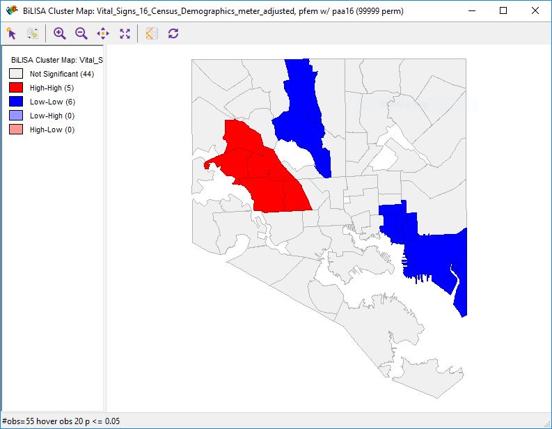 Bivariate local Moran’s I analysis of the percentage of female residents versus the percentage of African-American residents in Baltimore neighborhoods. The neighborhoods in red form the core of a cluster with high percentages of female and African-American residents, while the neighborhoods in blue form the core of a cluster with low percentages of female and African-American residents.
On the other hand, when the same analysis was performed comparing the percentages of female and African-American residents, the “white L” jumped right out in the form of two clusters of low concentrations of African-American and female residents. Meanwhile, the heavily African-American neighborhoods of West Baltimore formed a cluster of high concentrations of both African-American and female residents.
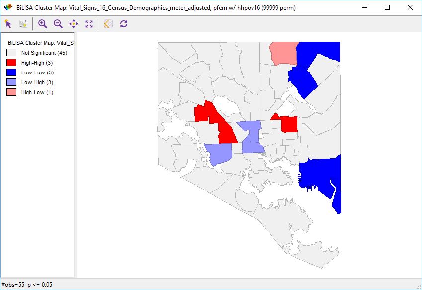 Bivariate local Moran’s I analysis of the percentage of female residents versus the percentage of households experiencing poverty in Baltimore neighborhoods. Dark red indicates clusters with high concentrations of both female residents and households experiencing poverty. Dark blue indicates clusters with low concentrations of both female residents and households experiencing poverty. Light blue indicates clusters with high rates of poverty but low concentrations of female residents, while light red indicates clusters with low rates of poverty but high concentrations of female residents.
Analysis of the spatial correlation of high percentages of African-American residents and households experiencing poverty gave somewhat more complicated results. However, it’s interesting to note that the same high-low and low-high clusters seen in the bivariate analysis of the percentages of African-American residents and female residents appear here, too. Low poverty rates do not seem to prevent African-American neighborhoods from having high rates of female residents, nor do high poverty rates seem to cause non-African-American residents to have high concentrations of female residents.
Conclusion: Race and Gender are Correlated in Baltimore
While a visual analysis of the percentages of African-American and female residents, and of households experiencing poverty, in Baltimore suggests that all three statistics follow similar patterns, a more rigorous analyis using local Moran’s I autocorrelation statistics suggests that the percentage of female residents in neighborhoods (a proxy for inprisonment rates of residents) is particularly strongly correlated with the percentage of African-American residents.
Two large clusters of neighborhoods with low percentages of African-American residents and female residents, corresponding with Baltimore’s recognized “white L” of neighborhoods clearly fell out of the analysis, as well as a large cluster of neighborhoods with high values for both statistics made up of much of majority-African-American West Baltimore.
Both of these variables did also seem to be spatially correlated with high concentrations of poverty, but the relationships were more complex. In particular, neighborhoods where the percentages of African-American residents and households experiencing poverty trended in opposite directions, the percentage of female residents followed that of African-American residents, not that of households experiencing poverty.
More analysis is definitely needed before reaching any definite conclusions, but my suspicion is that, while Baltimore has some high-poverty areas that are not heavily African-American, and some low-poverty African-American areas, the American carceral state’s particular tendency to target African-Americans—rather than simply targeting low-income urban populations—is responsible for this pattern.
Discussion of Data Sources and Software Used
The analyses was performed using data from the Baltimore Neighborhood Indicators Alliance’s “Vital Signs 16” dataset.
Initial maps of the three chosen statistics in Baltimore were made in QGIS 3, and the boundaries of the neighborhood shapefiles were also adjusted with this program.
GeoDa was used to perform the cluster analyses in both Part 1 and Part 2.